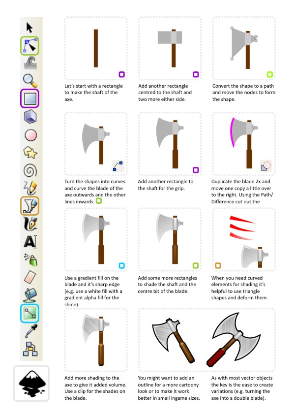
It's been way too long since the last post. I am still around and as eager as always to write some hopefully helpful tips on how to create some assets for your game/ illustrations or just for the fun of it.
One requested tutorial I received was on weapons and how to create something looking decent in inkscape. Due to the multitude of weapons out there and even more creative variations used in phantasy games and RPGs, I decided to split the request into two or three tutorials and start off with an axe.

Here's a sample of those two axes scaled down to 64x64 pixels and 32x32 pixels for use e.g. in inventories or equipped to the character.


In the smaller version you can see the limitations of the dimensions. Adding more detail to the axe when the final ingame size is just 32x32 or smaller wouldn't make much sense as you lose most of it when scaling. It also gets harder to read the object as an icon.
Tip:
Keep your output size in mind when creating your vector images. The image might look awesome on your 24" monitor. Yet a lot of the time consuming details added to them might not be visible in the image used in the game.
It helps to zoom out every now and then and look at the art in a size close to what you will use in your game.
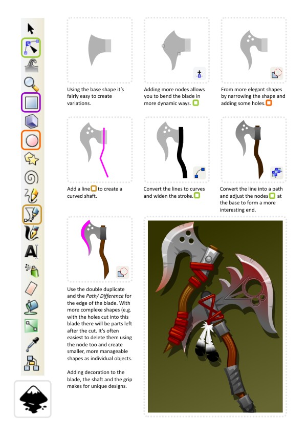
Let's take the simple hand axe and turn it into something a little fancier. We have the basic blade - a little dull and boring but a good starting point.

Tip:
For some additional colouring of the blade (e.g. the reddish tint I used on the two blades above) it's easiest to create a duplicate of the blades base shape and give it a coloured tint and then turn it into an alpha gradient. The transparency allows you to shade only certain areas of the blade.
For the smaller blade I used two of those shapes running from bottom up and another one from top left to lower right.

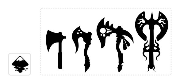
When creating a whole set of weapons to allow a character to evolve and update his equipment it's helpful to line up your designs and 'sort' them from the simpler shapes to the more complex and decor rich designs to give the player a sense of upgrading visually.
That's it for now... I will continue this set of tutorials with some rambling about designing swords next. I hope you enjoy this as much as I did writing it. Good luck with your designs.
Anda baru saja membaca artikel Situs GAME NETBOOK GRATIS .exe .zip .rar yang berkategori dengan judul Hacking and Slaying... back into action. Anda bisa bookmark halaman ini dengan URL https://netbook-game.blogspot.com/2013/06/hacking-and-slaying-back-into-action.html. Terima kasih!
Posted by: templates-office.com
Hacking and Slaying... back into action Updated at :
08.16


Belum ada komentar untuk "Hacking and Slaying... back into action"
Posting Komentar