Selasa, 28 Februari 2012

Building isometric art in vectors - step 1


I have had a few request to do something isometric - usually the requests cover characters and animation or more complex elements like buildings. As usual I am trying to start a little easier to ease the learning curve and create a simple isometric grass block (how boring of me ;) )... but... the next tutorial is already in the making and I find isometric art a lot of fun - well more fun now than back in the old days when I had to pixel them in 16x16 blocks with a handful of colours and still make them look good...

Anyway... What is isometric art? 
According to wikipedia isometric projection is: 'Isometric projection is a method for visually representing three-dimensional objects in two dimensions in technical and engineering drawings. It is an axonometric projection in which the three coordinate axes appear equally foreshortened and the angles between any two of them are 120 degrees.'

Now that's a mouthful... and please... don't ask me to explain it.... I just use it...  ;) Basically it's an attempt to fake a three dimensional feel in 2D by rotating the ground 45 degrees and ignoring the perspective scaling (objects do not get smaller when they are further away). 

Let's get started with some basic steps into isometric projection. This is close to 'true isometric' but not quite there - but a lot easier to handle artwise. 

Note:
With different game engines you might encounter slightly different proportions as far as the vertical scaling goes... but the process of creating the elements would be very similar.


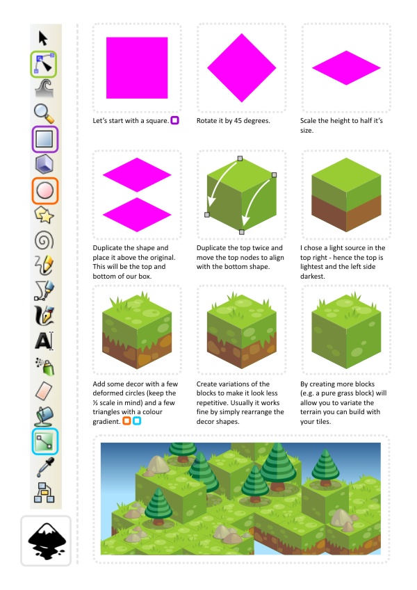
For my little scene I added a quick tree - with a couple of circles (keeping the 1/2 deformation ratio in mind)  and some simple rocks based on the same circles - and it's already starting to look like something you would expect to see in a game. 

The main problem you will encounter when creating whole scenarios in inkscape based on 'isometric blocks' is the depth sorting. It will only look right if the tiles are stacked properly and the furthest away (top left corner of the screen) are on the bottom of the pile and the closest (front right corner) are on top of the other shapes.

I hope you enjoyed this quick post and it's a start into the creation of isometric tile-sets. I will continue this tutorial with props and buildings next (and yes.. I will do characters and animations as well... ).

Note:
Turning on the snapping in Inkscape makes aligning nodes in step 5 a lot easier. 

Turn on the snapping
View/ Snap (%) to align nodes precisely to others. In the snap button bar there is a button  to 'snap nodes or handles' (7th from the top) and by turning on the sub-function 'snap to cusp nodes' (10th from the top) allows you to snap nodes perfectly. 
In case it's still not as responsive as you would like go to the Inkscape Preferences (Shift+Ctrl+P) and change the weight for the snapping there.


Get the source art (svg file) of this tutorial for
USD 3.00


templates-office.com
Rabu, 22 Februari 2012

Working with bitmap output in mind

Here's another request (or a a combination of requests) put into a tutorial. How to create vector art that looks good in a small e.g. 48x48 px size. 

One of the advantages of vector graphics is it's lossless scalability. You can easily create an image and scale it up and down without sacrificing the quality. There will be no jagged edges or visible blocks when you increase it's size by a tenfold. It also works nicely the other way round by creating source files that can be used for smaller in-game images. 

To me it's a lot easier to create a few circles and boxes than to pixel a character from scratch. It can then be animated in inkscape and exported to bitmap and worked on with a bitmap tool (e.g. gimp) afterwards. 

I like to work with files 2x the output image for a slightly larger work area - and because I find the scaling algorithms work better in bitmap tools then exporting straight to the small size in inkscape.

The main elements are there and it's time to check what our little character will look like in its small in-game size. I primarily want to check if the outlines will still work in 48x48 or if they become too thin to be readable or are just too big and overwhelm the character. 

Now we have our character and it's exported to a bitmap file.

Note:
I skipped the adding of more detail (e.g. the shadow line of the hair (which is basically just a copy of the hair shape without the stroke and coloured in a 50% alpha dark violet) and the highlight in the hair (which is a quick squiggle with the freehand lines tool).

You should have something like this: a 96x96 px image with a transparent background and the little guy in his full glory. Thanks to the antialiasing it doesn't look much different from our vector shape. 

Now we open the file in the bitmap tool (e.g. gimp).

In gimp we reduce the size via 'Image/ Scale Image' to 48x48 and should get something like this. It still has the antialiasing which rounds of the edges and smoothes the steps. 

If you are after a more pixelated look I suggest reducing the colours (e.g. to just 16 colours) and manually touch up the image, removing AA outlines and redrawing the outer lines to be even. 

This would be a topic for a whole new tutorial - and I will add it to my todo list. For now I hope you enjoyed this tutorial and keep creative with inkscape. 

Note:
Some engines (especially for the iOS and android require set dpi (dots per inch or x and y resolution). I find it hard to adjust my art properly in inkscape to export to the right dpi straight away. Instead I change the dpi in the bitmap tool whenever needed. In gimp it's done in the 'Scale image' tool. You can set the x resolution and y resolution (e.g. to 72 dp[i for iOS applications) when scaling down.


Get the source art (svg file) of this tutorial for
USD 3.00

templates-office.com
Senin, 20 Februari 2012

Creating a brick building

This is a tutorial requested by one of the readers on how to create a building made of brick. In order to clarify what he meant I quickly created this one and wrote up the tutorial to explain the steps. 


There are a few  problem when adding pattern added to a shape. You have to make sure it's seamless (it tiles properly horizontally and vertically). You have to make sure it scales well with your object (too much detail might be lost in a smaller view and too little detail will look boring) and you need to make sure it matches the illustration style (a bitmap photo in a vector illustration might cause serious inconsistency in the look and feel). 


This is a brick building. We all recognize the pattern but it looks boring because the blocks are too big and too even. It's also not the best design for a house. 


Let's get started with a bunch of rectangles and build a more interesting looking house and then add the nicer brick pattern to it.


So... We got a simple yet decent looking house...


put into a row with varying colours it looks rather nice. It's open to a lot of designs now (e.g. you could add wood boards as a pattern and place it in Scandinavia.).  


For now we are after bricks so let's add some pattern.


When creating a pattern always try and look at the larger project rather than the one element you are working on. Will you need to reuse the pattern? Will there be colour variations? Do I need to make it scalable? You can save a lot of time and repetitive work  if you keep those questions in mind. Work with e.g. transparent elements for shaders rather than tinted variation of the base colour or convert your lines into paths to allow for a proper scaling.


I hope you enjoyed the tutorial as much as I did creating it. Have a great day and keep your creativity flowing.


Get the source art (svg file) of this tutorial for
USD 3.00

templates-office.com
Kamis, 16 Februari 2012

Creating a character with outlines

Here's one request I have read a few times now: 'How do you make a character with outlines?'. It's not much different from any other character creations you just add a little more difficulty and a few problems to work around. 

The main problems I see with a lot illustrations using outlines are: a) the inconsistent line weight (different thickness of the stroke for different elements on the screen). It's a little more complicated and takes some thought to design the screen balanced. My advice is to keep it either keep it all at the same thickness or use a thicker brush for all the focus elements (eg. characters, logo, UI elements) and create the background with a thinner stroke. b) the colouring of stroke vs. the colour of the shape. c) the line weight does not correspond with the illustration. You might have noticed it in comic books, illustrations or animated cartoons - the stroke is not consistent in thickness. It starts thinner, goes thick and ends thin again giving it more of a brush feeling. If it's done right it really enhances the image but it's a time-consuming art. Simply using tools in Adobe Illustrator or Corel Draw to create dynamic brushes usual ends up looking wrong.  

All those problems aside. Let's start with something simple.In this tutorial we will do a little piglet with a plain black stroke that stays consistent throughout the elements. In one of the next tutorials I will cover more complex and modified outlines.

The last two steps show one of the main problems with outlines - the overlapping of elements creates lines we don't want to see. You could just combine the snout and the head. Simply making it one object would result in problems animating it afterwards. This becomes even more visible in arms and legs. I prefer just adding shapes to cover those overlaps.


The tail might not the usual corkscrew design you see in a lot of pig illustrations - it was one of those cases of thinking you know how it looks versus the way it looks. In the end I checked on Google images [the best invention since sliced bread] and had a look at real piglets and found this cute little tail more appropriate.


And the last step - I forgot to add it to the tutorial pages - (remember I am fresh off the vacation) is a cover shape for the legs to join them with the body. 

I hope you enjoyed this tutorial. Get out inkscape and start creating!

Get the source art (svg file) of this tutorial for
USD 3.00

templates-office.com

Vacation is over!

I am back from the vacation and glad to be home. The two week cruise to NZ is over, the suitcase unpacked and it's time to post. 

Besides doing nothing, eating too much good food and sleeping 2x as much as usual, I used the time on the ship to draw and sketch on my iPad and I might just do the odd tutorial on how to get the most out of the drawing tools available. 

After two weeks of not having computers or internet [ship's internet was painfully slow and overpriced to the point of being ridiculous] it's good to be back...

All refreshed, recharged and ready to roll I will try and work through all the requests for tutorials from you guys. :)


templates-office.com