Just a quick tutorial on how to create an outline/ highlight effect. I like to use this effect a lot for menu texts/ mock-ups as it's quick to create and it looks rather nice.
The key to this effect working/ looking good is the right font. Choose a bolder/ thicker font to allow the inset to work.
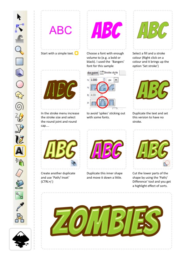

Enjoy playing around with this one. I would suggest trying multiple stroke objects with decreasing stroke width to get double or triple outlines.

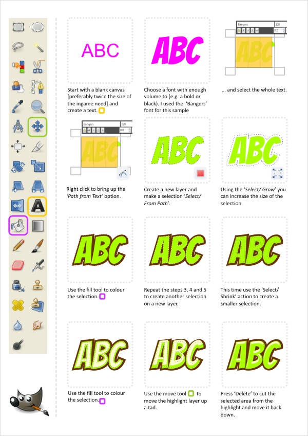
And for all those Gimp users - it's not that hard to create this kind of effect either. It's a different approach in gimp but by using selections and growing and shrinking those you can achieve a very similar effect.
Tip:
There is a stroke effect in Gimp and it allows you to add a stroke to a path made either from an object or a text. It offers a lot more flexibility than the outline created by the growing selection. (Edit/ Stroke Path).
Enjoy!
templates-office.com


