This has to be one of the most requested tutorials has to be on shading. How do you do it? Why do it? Where do I add shadows and what colours do I use? Lighting is vast area and the possibilities are shear endless. In this tutorial I tried to cover the absolute basics with one of the simplest shapes - the ball.
If used correctly light and shadow will make your scene / object look a lot more spectacular, real and visually appealing.
Let's start with a circle - I know this must be the 100s time I have written those words - but it's still the easiest object to work from.

The result is not realistic and not overly cartoon like. If you aim for the latter cell shading with 2 to 4 colours will do the trick. To get the ball to look more realistic the highlight elements would require more work - and a Google image search for something like Christmas decoration.

As the ball gets closer to the light source the effect of the light should be stronger - lighter highlights and darker shadows with the effect of the secondary light source less visible.
If used correctly light and shadow will make your scene / object look a lot more spectacular, real and visually appealing.
Let's start with a circle - I know this must be the 100s time I have written those words - but it's still the easiest object to work from.
The result is not realistic and not overly cartoon like. If you aim for the latter cell shading with 2 to 4 colours will do the trick. To get the ball to look more realistic the highlight elements would require more work - and a Google image search for something like Christmas decoration.
Let's take a quick look at the effect of changing light on our ball.
As the ball gets closer to the light source the effect of the light should be stronger - lighter highlights and darker shadows with the effect of the secondary light source less visible.
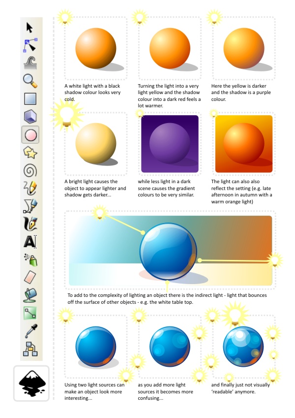
One question I have been asked a lot concerns the choice of colours. The very basic shading would be by simply using white for the highlights and black for the shadows. In my opinion the result usually looks dead and cold. I prefer warmer light and my favorite shadow colours are dark purple or dark brown (with adjusted alpha). That way you get warmer tones and more lively colours.
Then again the scene you are trying to influences the colours of your light and shadows. E.g. an underwater scene would look very odd with brown or red shadows - you would choose a white/ blue/ green colour-scheme. A summer afternoon would have a light yellow/ gold/ dark brown or deep red palette - while a winter's day would have white/ blueish grey and black.
Here are a few examples of the effect colours have on the shading of an object.
In the end it's a matter of playing around, finding the right light to set the mood for your scene and then stick to it for all the objects in your scene. Have fun with it! Try to find something that enhances the mood and the atmosphere you are after and don't be afraid to try 'odd' colour combinations.
Note:
If you create game assets keep changes to the scene in mind. To avoid having to create dynamic lighting - which looks awesome but is a lot of work on the coding as well as the art creation side of things - I would suggest sticking to a standard light setting (e.g. top down - that way flipping a character horizontally to walk in the opposite direction does not mean creating new assets to keep the scene looking consistent). It can also be very helpful to separate the shadows form the objects for allow jumps and walking on non-horizontal surfaces to look right.
I hope this was helpful so far and I plan to add to this tutorial in future with some more advanced objects and more complex shapes. Enjoy!
Get the source art (svg file) of this tutorial for
USD 3.00
templates-office.com


