Rabu, 12 Juni 2013

Choosing your highlight and shader colours

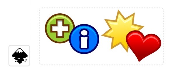
I am not into colour theory - having worked by instinct most of the time - so picking the shading colours to me is not a big decision. 
Today I received that very question on the blog [again] and after a quick try I came up with this:


I hope this is helpful! Enjoy!


templates-office.com
Minggu, 09 Juni 2013

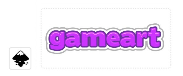
Quick and dirty - a simple effect for menu texts

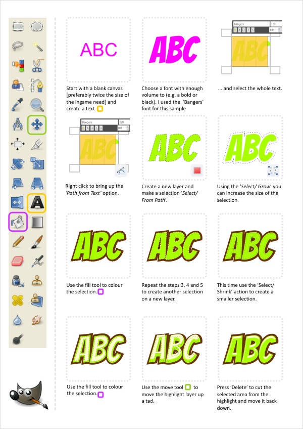
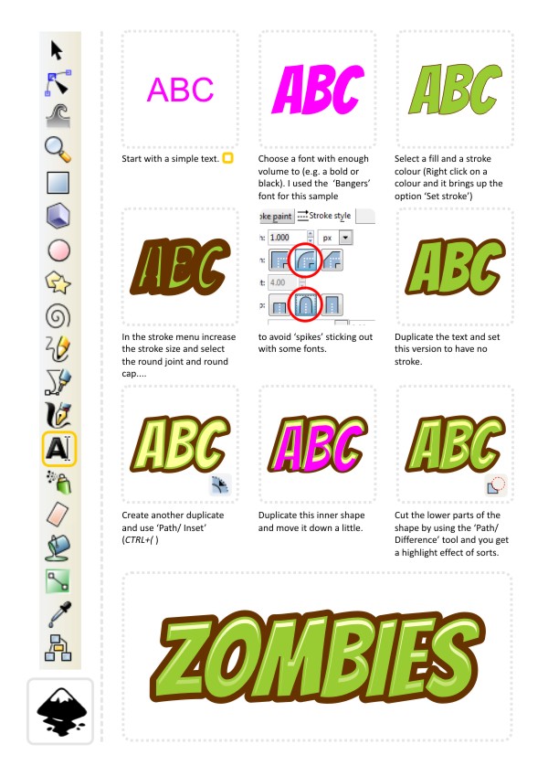
Just a quick tutorial on how to create an outline/ highlight effect. I like to use this effect a lot for menu texts/ mock-ups as it's quick to create and it looks rather nice. 

The key to this effect working/ looking good is the right font. Choose a bolder/ thicker font to allow the inset to work. 

You can use the same workflow on any sort of object - not just fonts. Buttons, icons or bullet points look nice with the highlight and a little gradient fill added to them. 


Enjoy playing around with this one. I would suggest trying multiple stroke objects with decreasing stroke width to get double or triple outlines. 


And for all those Gimp users - it's not that hard to create this kind of effect either. It's a different approach in gimp but by using selections and growing and shrinking those you can achieve a very similar effect. 

Tip:
There is a stroke effect in Gimp and it allows you to add a stroke to a path made either from an object or a text. It offers a lot more flexibility than the outline created by the growing selection. (Edit/ Stroke Path).


Enjoy!

templates-office.com
Sabtu, 08 Juni 2013

Hacking and Slaying... back into action


It's been way too long since the last post. I am still around and as eager as always to write some hopefully helpful tips on how to create some assets for your game/ illustrations or just for the fun of it. 

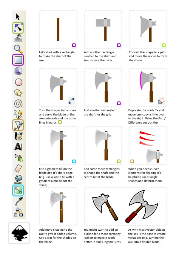
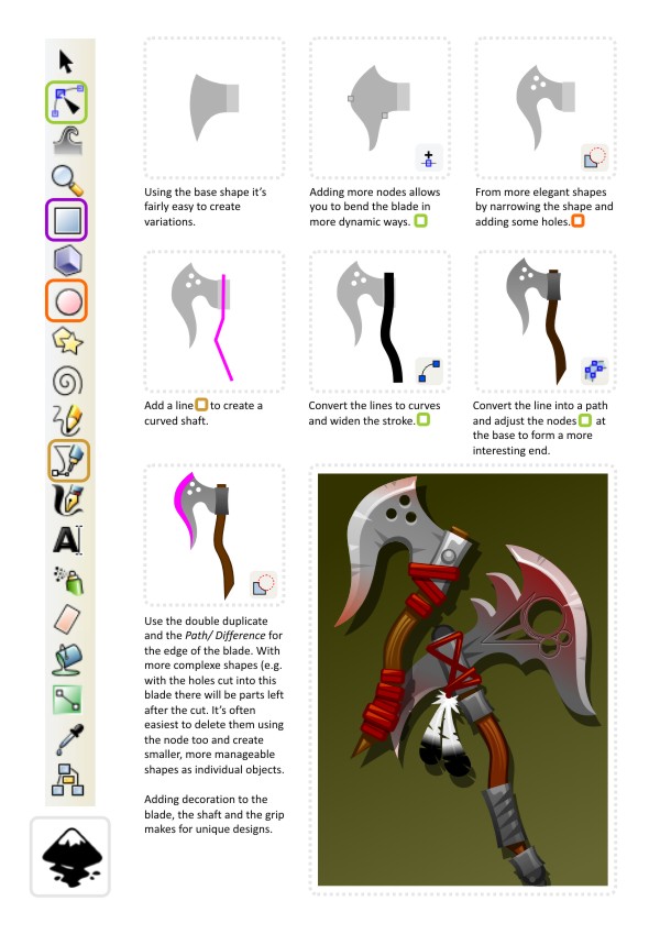
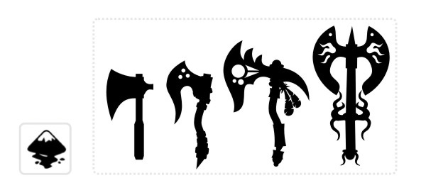
One requested tutorial I received was on weapons and how to create something looking decent in inkscape. Due to  the multitude of weapons out there and even more creative variations used in phantasy games and RPGs, I decided to split the request into two or three tutorials and start off with an axe. 


Here's a sample of those two axes scaled down to 64x64 pixels and 32x32 pixels for use e.g. in inventories or equipped to the character. 


In the smaller version you can see the limitations of the dimensions. Adding more detail to the axe when the final ingame size is just 32x32 or smaller wouldn't make much sense as you lose most of it when scaling. It also gets harder to read the object as an icon.

Tip:
Keep your output size in mind when creating your vector images. The image might look awesome on your 24" monitor. Yet a lot of the time consuming details added to them might not be visible in the image used in the game. 
It helps to zoom out every now and then and look at the art in a size close to what you will use in your game. 

Let's take the simple hand axe and turn it into something a little fancier. We have the basic blade - a little dull and boring but a good starting point.  


Tip:
For some additional colouring of the blade (e.g. the reddish tint I used on the two blades above) it's easiest to create a duplicate of the blades base shape and give it a coloured tint and then turn it into an alpha gradient. The transparency allows you to shade only certain areas of the blade. 
For the smaller blade I used two of those shapes running from bottom up and another one from top left to lower right. 


When creating a whole set of weapons to allow a character to evolve and update his equipment it's helpful to line up your designs and 'sort' them from the simpler shapes to the more complex and decor rich designs to give the player a sense of upgrading visually.

That's it for now... I will continue this set of tutorials with some rambling about designing swords next. I hope you enjoy this as much as I did writing it. Good luck with your designs. 

templates-office.com
Senin, 22 April 2013

Still not voxel dwarf game

Progress is still on hold while I complete course work and I missed screenshot Saturday :( However I'll be done by the end of the week and done with exams in two weeks. Anyway, island terrain generation is still damn fun. I've added variables for customization for a little variation on the islands.

This is the player island, blue squares mark available slots for boats and light colored chunks of terrain are available to place buildings like farms and factories.

Extra large beaches, extra large island, less exponential terrain

Small beaches, smaller island, 
So, why not use unity terrain? I chose early on to generate this terrain and build the meshes with code while unity terrain sounds like a simpler choice. A few factors led to this, of course one is that I love procedural terrain. Otherwise though: first, once written the code can generate any amount of islands. Although we're not using more than four or five we have made a lot of changes to what we wanted from these islands. The size was originally going to be much smaller but we increased it as we needed more land to work with. I can easily change the size of my islands without rebuilding anything. Secondly I base where you can build on heightmap data, something that I have simple access to in my own code. And lastly the way I've implemented these meshes has let me create a simplified pixel graphic look for the terrain that is minimalist and almost cartoony. This lets us get away without breathtaking visuals while still looking good.

With all this in place it's fun to think about larger applications of it, maybe getting to sail around an infinite sea of islands, trading with them, maybe fighting off pirates and eventually running your own island. I wish I had time to program everything I think of.


templates-office.com Island Game, Terrain Generation
Selasa, 16 April 2013

Not Voxel Dwarf Game

I've been busy with assignments lately so I haven't been able to dedicate so much time to my own project but this blog is called Student Game Dev after all. Lucky for me the assignments I've been working on are actually relevant, me and two friends are making an island management /resource management game for kids where they control the production of an island and trade with their neighbors.

The islands are procedurally generated of course.


The best part is that just a few hours work to make this island and I can apply the code as many times as I want. If I add some random variations to things like beach size, mountain likeliness and island noise I could get some very varied outcomes.


Anyway I'll be back to work on the voxel dwarf game soon and with any luck some of the trade and resource management elements of the island game will be useful to the dwarves.


Update:


templates-office.com Island Game, Terrain Generation
Jumat, 12 April 2013

(Heart) KOFFERT

This is the game a friend and I made for game jam 2013, it's a little late (3 months or so) but I forgot about it entirely in the 12 straight hours of sleep after the two days of programming. We were given a theme that was the sound of a beating heart so naturally we made a game where you steal people's hearts and transplant them while sneaking around the hospital.

Since I had written some stealth code before I figured I was up for the challenge of writing new pathfinding and detection code in 48 hours. In the end what I managed to do in 48 hours was much better than what I had written previously probably because of the experience I gained from the last time I tried it.

In this picture the player (A black cylinder) hides from a guard (A black cylinder with a field of view cone) behind a column, he has the heart in his briefcase.
The game is pretty buggy and incomplete, there are no character models. There are three levels, essentially you find the patient with the heart, put it in your briefcase  make your way to your patient and win the level. On your way you'll have to hide from guards by staying in the shadows and/or out of their field of vision and with the heart in your briefcase you'll have to stop by other patients to fill up with blood so the heart keeps pumping. There are also blood packs available that fill you half way up with blood as soon as you run out and adrenaline shots that let you move faster for 10 seconds.

Also you can save and load from last save in the pause menu (esc) this is useful for trying things and not starting over from the beginning.

You can play it here.

templates-office.com Jam, Stealth
Selasa, 09 April 2013

Shaders and cutaway


I've been working on the function to cut off mountain tops to a specified level so the player can see their tunnels and rooms under the surface. For this I've written a shader to clip off level geometry above a certain point. The function works but will need some additions to look right.
Also in this shot: check out the roughness of the water in the sun, this is from the noisy surface and the lighting. It changes as the day goes on.
The black outlines around the cutaway are a happy byproduct of the edge detection
I'm considering generating a mesh to "cap" the tops of the cutaway so you will only see tunnels and rooms that intersect the cut, not everything below the point of the cut. It may make it easier to see the cut but seeing your network of underground tunnels and rooms at different levels would be fun.
templates-office.com Voxel Dwarf Game

Outlines

I've added some outlines to add borders to the edges of mountains which is an interesting effect.

Outlined mountain edges make it easier to make out the shape of the different mountains in the distance

When turned up the effect creates a cell shading effect outlining the corners of blocks which is a surprisingly useful effect to help see the edges of blocks. It does give the game a much more cartoony look though.
Fake cell shading
templates-office.com Voxel Dwarf Game
Minggu, 07 April 2013

Noisy Meshes

After experimenting with mesh manipulation I'm considering adding some noise to the meshes I generate for blocks, give it a bit more of a varied feeling.

Very noisy terrain

Slightly noisy terrain
This is actually a very cheap way to create noise in the mesh because instead of using a shader to deform the meshes or taking the mesh and manipulating it I use the values used to generate the terrain to decide a bit of variation in the height of each corner to offset the mesh gen values while I generate them. This could use some tweaking but a little noise could go a long way in adding variation the the map and to make it look less like Minecraft, which currently is the first thing anyone notices about the game.
templates-office.com Voxel Dwarf Game
Kamis, 04 April 2013

Out of the cold for a bit

I am sick and tired of the cold and the winter and having the flu, the cold, some virus or another... It's time for some warmth and sunshine... so I am off... last minute trip to where there is sun, beach and palms. 

I won't be checking my emails regularly - as I am not sure about internet access and my motivation to check when there is sunshine and ocean out there to swim, snorkel and dive. Please have a bit of patience when you order some of the tutorial art or BlockBuddies. I will do my best to get the art to you asap... back on April the 16th...


templates-office.com