Rabu, 16 Mei 2012

Wooden Platforms - putting the wood into action

It's been a while and I decided to get back into the tutorials with a request for wooden platforms as used in the wood material tutorial:


http://netbook-game.blogspot.com.au/2011/11/making-materials-wood.html


A lot of this tutorial is repeated here in a slightly less detailed way - you might want to reread the older tutorials if you run into problems.


Note:

If you work with bitmap output in mind I would suggest creating the platform as a bitmap first. This way you have the proper dimensions to work with. Import the bitmap and create the starting rectangle to match. 


One platform for everything might work - but adding variations to your games art greatly enriches the look and feel. 

I hope this was helpful and you enjoyed it as much as I did writing again.


Get the source art (svg file) of this tutorial for
USD 5.00

templates-office.com
Senin, 14 Mei 2012

Orcs Must Die Review

Hi my name is Nik and today i am taking a look in to one of the most addicting games of last year:

So Orcs Must Die is a game about killing orcs - simple as that. There is some basic story - you are a warmage that defends the portals to the human world, called rifts, from orcs. The really good part of the game however is the killing of the orcs part and that is so satisfying and so addicting everyone that like killing things in games will love it (i know i do).


The game is a very interesting mix of tower defense and a third person action game - you lay traps on the orcs path, but they are not enough to kill them all, so you have to help them, with some of your weapons, like the crossbow, blade staff, fire bracers and several other weapon. But there is a much grater list of traps then weapons - spike trap, tar pits, arrow walls, floor scorcher and much more will give you a very good selection of ways to kill orcs. When you complete a level you get skulls, up to five depending on how well you did, and with this sculls you can buy upgrades for your favorite traps.


Graphically the game has this nice cartoonie stile witch suets it very well- its not crysis but the textures are good quality and you get good frame rate on the PC version. The game sounds nice and goofy witch compliments the humor and graphics stile. The only problem i have with the game is that it doesn't have Co-Op multiplayer, but they are fixing that with   Orcs Must Die 2 witch should come out this summer.
One last answer i should probably answer is Orcs Must Die vs. Dungeon Defender and the simple answer witch i think is right is that Orcs Must Die is a better singleplayer then Dungeon Defender, so if you like Co-Op get Dungeon Defender, for single player get  Orcs Must Die.
So to top it all of  Orcs Must Die is one of the best orcs killing simulator with a nice and unique graphic stile, nice sense of humor and grate gameplay.
You can get Orcs Must Die for PC and Xbox 360. 

If you want to check out my other Game Review Click Here.

Gameplay video 


  I hope you liked my review of  Orcs Must Die.
If you did please comment and share with your friends.
Have a nice day.
templates-office.com computer, Die, game, games, killing, Must, Orcs, pc, playing, Racing, review, video
Sabtu, 12 Mei 2012

The Walking Dead Review

Hi my name is Nik and today is a day for another game from Telltale games :


You are probably thinking "oh great another mindless zombie shooter", well fortunately its not. The walking dead is a point and click zombie survivor game. You play a character named Lee, who in the start of the game is in a police car and you are on your way to jail. You have a little talk with the cop driving you and while he isent looking at the road a zombie appears in the middle of the street, the car hits it and crashes. When you wake the car is upside down the cop is dead and your leg is cut. You manage to get out of the wrecked car and you start looking for survivors. Not long after you find some and you have one goal -  survive. In some stages of the game you have choices like "how to save is you are alone and you have two people being attacked" and the best part is that you have limited time to make the choices and that goes for any  choice in the game - even in a simple conversation you have time within you can say something, if the timer runs out - you stay silent. The story has nothing to do with the TV series, except the world and the zombes - no spoilers to the people that haven't watched it yet.
Graphically the game looks nice for a cel-shaded game witch reminds me a lot for borderlands.The music is a very nice for the style of the game-it keeps you in anxiety even when you are save.
So to top it all up The Walking Dead is a very nice looking and sounding, zombie survivor game with a lot of originality and a nice story.
You can get the game on PC, Xbox and PS3.


 I hope you liked my review of The Walking Dead.
If you did please comment and share with your friends.
  Have a nice day.
templates-office.com computer, game, games, killing, pc, playing, Racing, review, video
Rabu, 09 Mei 2012

Sky Drift Review

Hi my name is Nik and today is a good day to take a look at:


As you probably figured from the name Sky Drift is a game about racing with airplanes, someone compared it quite accurate to mario kart in the sky. This game is all about things only - speed! All of the planes fly very fast and you have to make sharp turns true in tight places - its grate. But the speed isn't your only weapon against your opponents, you can use rockets, cannon (machine guns), mines and shockwaves witch you puck up as power-ups. The other power-ups are shields and repairs. You can hold two power-ups of any type and if you pick a second of the same type it will get much stronger.


Of course as any racing game this one has boost, you can get boost by flaying close to the ground or walls, killing enemy planes or destroying boosts that you have (level two boosts give you move boost when destroyed). The game has 6-7 maps(on same races you get the reverse versions) witch doesn't sound like a lot, but the maps are diverse, beautiful, and changing so you cant really get bored by them. You also get a selection on 9 planes (with 4 skins per plane) and each one them files different and unique. 
There are three types of races - Power Race witch is the standard all power-ups three or four laps race, Surviver witch is elimination with all power-ups mode and then there is Speed Race, witch is my favorite, you don't have any power-ups, but there are speed ring threw the map and when you go threw a ring you get a boost of a speed - more rings equals more speed. There is also a fourth type witch is only in the finale level of the game and its a mixture of  Surviver and  Speed Race - speed rings and elimination in one.


Graphically the game is beautiful - grate lighting effects, some of the best motion blur that i have seen since NFS: Most Wanted and a dam good estetik make this one of the best looking racing games ever. The sound track is heart pumping fast drum and base, techno or rock - depending on the level. There is no story line is this game, witch is a good thing cuz that means more for flaying not listening to stupid crap you don't want. The only problem i have with the game is that its difficult to play with a keyboard, so even for PC i recomend having a gamepad or xbox controller 
So to top it all up Sky Drift is a fast racing game with power-ups, beautiful graphics, grate soundtrack and a very nice level design.
You can get the game on PC, Xbox and PS3.

If you want to check out my other Game Review Click Here.

Gameplay video


 I hope you liked my review of Skydrift.
If you did please comment and share with your friends.
 Have a nice day.
templates-office.com computer, game, games, killing, pc, playing, Racing, review, video
Senin, 07 Mei 2012

Super Meat Boy Review

Hi my name is Nik and today i am going to take a look at the most rage infusing game i have played:


So super meat boy is a precision, high speed platformer and its dificult as they come, but very rewarding when you get a level done. The "story" is preity simple you are meat boy, who is actually made from meat, you love a girl named Bandage. She has being kidnapped from Dr. Fetus - you must save her. So it's cheese, but what is more important its short.
The meat of this game(you see what i did there) is its gameplay. The movement is precise and its very easy to get used to. The only real problem with it, is that its terrible with a keyboard, so even on pc, you have to have a game pad or a xbox controller. The keyboard controls are so bad, they warn you in the start of the game. As far as obstacles go everything can kill you - lava, fans, salt, spices, trowing disks, bottomless pits and much, much more. One of the innovating game mechanics is wall sticking and its exactly what it says it is - you stick to a wall and  start sliding down the wall, you can jump from it, at several angles to get the best results.

The game has online leader boards and a replay save system, witch is very handy for showing of to friends or uploading videos to youtube. Graphically the game has smooth animation quality and good texture quality, but its not a triple A title level of graphical fidelity. The soundtrack is grate- its fast, its heart pumping, its the right atmosphere for the game. And one last thing, this game is long and when i say long i mean over 300 levels long, so you have a lot of content for your money. 
So to top it all up super meat boy is a very hard, but very satisfying platformer, with very little problems.
You can get the game on PC(Win and Linux), Mac OS and Xbox Live Arcade.

Gameplay video

I hope you liked my review of  Super Meat Boy.
If you did please comment and share with your friends.
Have a nice day. 
templates-office.com computer, game, games, killing, pc, playing, Racing, review, video
Minggu, 06 Mei 2012

Still alive...

Sorry about the long break between posts... I am in the middle of some turmoil at the moment and a iOS project blew out of scope artwise and turned from a quick 'couple of days' job into a full blown production. With the end of in sight more tutorials will be coming as soon I got my feet back on the ground. ;) 


templates-office.com
Jumat, 04 Mei 2012

Back to the Future: The Game Review

Hi my name is Nik and i am going to take a look at another of my favorite games of last year:


Back to the Future: The Game when i first heard about this i was like: "What? Can Telltale games give this game the story that a Back to the Future game deserves ,or they will screw it up like some many movie licensed games".And i was so surprised when i played it for the first time and it was good.
The game is a point and click adventure, divided into 5 episodes. It takes place a few mounts after the third movie and you are playing the roll of Marty Mcfly.The story starts with the fact that Doc has being missing for several mounts, he has a depth to play to the bank and they are about to sell his house. So you'r mission is to find him and get him back to 1985. Sunnenly the just as you walk around  Doc's house,looking for clues, the DeLorean appears with Einstein and a recording from Doc. You track him down, using a old newspaper, back to 1931 where he is accused of burning down Kid Tannen's speakeasy and will be killed by his gangsters. I am not going to spoil the rest of the story for you, but i am going to say that its very interesting to see how your actions in the past have effect on the future, just like in the movie.
Gameplay wise the game is a point and click so you mostly solve puzzles. Some of them are really good, some of them don't make any sense at all and if you are like me and hates puzzles witch make no sense you will love the hint tool.Its basically what it says, a menu in the game that has hints you how to solve some of the challenges, the nice thing about this tool is that it usually has more then one "layers" of hints. The first layer is a very miner hint, the second a bigger hits and the third usually tells you how to complete the puzzle. Of course i am not trying to say that all puzzles are bad, same are really good, like the house of glass in episode 5, or making the fuel in episode 1,the problem is that they are few and far between.
Graphicly the game is very unique,it reminds me kind of cartoonie feel of other games from Telltale. But the thing that really gets you, besides the grate story, is the sound design. All of the music is straight from the movie, all of the voice actors do there job perfectly and this gives the game the feel of the movies.
So to top it all up Back to the Future:The Game is a very fun, very atmospheric game with a story what will blow you away. You will love it if you are a fan of the movies, like me, and you will like it if you are a fan of point and click.
You can get the game on PC(it will run on anything), PS3 , IOs and Wii.

I hope you liked my review of Back to the Future:The Game.
If you did please comment and share with your friends. 
Have a nice day.
templates-office.com computer, game, games, killing, pc, playing, Racing, review, video
Minggu, 08 April 2012

Happy Easter!

I hope you are all having a great Easter. 

I surely did (even while working through most of a perfectly sunny day). As usual working made me think of great topics for the next tutorials... 

Once I am over the current mountain of work I have another 4 tutorials to write - just to put some fun into the mix. I wonder why work can't  be a nice steady flow than dry spells and monsters waves - well... I guess it's just a freelancer's life ;)

Enjoy your day! I am going to call it a night... :) 
templates-office.com
Minggu, 01 April 2012

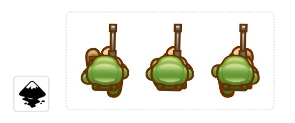
Top down view - Soldier

I am jumping wildly from iso to shading and now to a top down view. I apologize for the lack of order in the tutorial posts at the moment but I just felt like writing this one after creating the art for a request. 


Top down characters - there really is not that much to see when you look straight down on a character. You see the top of the head, the shoulders, a bit of the legs and the arms when they move. 


One way to show what the shape really represents is by adding a nice long shadow of the shape - which works well in 3D engines but it a proper pain to reproduce in 2D as the shadow needs to move with the character. 


Alternatively you can add more detail to describe the parts better and make them recognizable. 

In the case of the top down soldier it's going to be a matter of creating a helmet that is visibly a helmet, show parts of the gun he's carrying and give him a pose that connects the gun to helmet in a believable way (e.g. a rifle standing out to in the centre of the figure is not really believable as it would ram into his stomach). 


When animating the character it's pretty much just down to the feet and the shoulders corresponding to the leg movement - in a more limited way as our soldier holds his gun with both hands which restricts the movement a little.  


As with all the tutorials it's a matter of taking this and playing around with the ideas and create variations. How would a knight in armor look from above or a caveman or a girl with piggy tails?

Note:
I didn't go into great detail on topics covered in earlier tutorial posts (e.g. the manipulation of nodes or the gradients). If you have problems with those please check out the earlier posts on this blog. Thanks!


I hope you enjoyed this tutorial as much as I did creating the art. 


Get the source art (svg file) of this tutorial for
USD 5.00

templates-office.com
Selasa, 13 Maret 2012

Basic shading - the ball

This has to be one of the most requested tutorials has to be on shading. How do you do it? Why do it? Where do I add shadows and what colours do I use? Lighting is vast area and the possibilities are shear endless. In this tutorial I tried to cover the absolute basics with one of the simplest shapes - the ball.
If used correctly light and shadow will make your scene / object look a lot more spectacular, real and visually appealing. 

Let's start with a circle - I know this must be the 100s time I have written those words - but it's still the easiest object to work from.


The result is not realistic and not overly cartoon like. If you aim for the latter cell shading with 2 to 4 colours will do the trick. To get the ball to look more realistic the highlight elements would require more work - and a Google image search for something like Christmas decoration. 

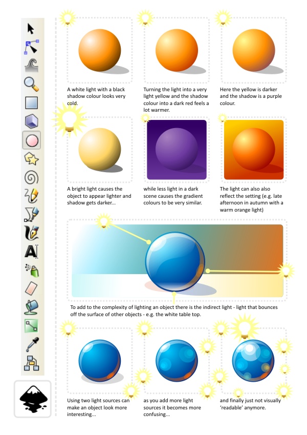
Let's take a quick look at the effect of changing light on our ball.


As the ball gets closer to the light source the effect of the light should be stronger - lighter highlights and darker shadows with the effect of the secondary light source less visible. 

One question I have been asked a lot concerns the choice of colours. The very basic shading would be by simply using white for the highlights and black for the shadows. In my opinion the result usually looks dead and cold. I prefer warmer light and my favorite shadow colours are dark purple or dark brown (with adjusted alpha). That way you get warmer tones and more lively colours. 

Then again the scene you are trying to influences  the colours of your light and shadows. E.g. an underwater scene would look very odd with brown or red shadows - you would choose a white/ blue/ green colour-scheme. A summer afternoon would have a light yellow/ gold/ dark brown or deep red palette - while a winter's day would have white/ blueish grey and black. 

Here are a few examples of the effect colours have on the shading of an object. 


In the end it's a matter of playing around, finding the right light to set the mood for your scene and then stick to it for all the objects in your scene. Have fun with it! Try to find something that enhances the mood and the atmosphere you are after and don't be afraid to try 'odd' colour combinations.

Note:
If you create game assets keep changes to the scene in mind. To avoid having to create dynamic lighting - which looks awesome but is a lot of work on the coding as well as the art creation side of things - I would suggest sticking to a standard light setting (e.g. top down - that way flipping a character horizontally to walk in the opposite direction does not mean creating new assets to keep the scene looking consistent). It can also be very helpful to separate the shadows form the objects for allow jumps and walking on non-horizontal surfaces to look right.  

I hope this was helpful so far and I plan to add to this tutorial in future with some more advanced objects and more complex shapes. Enjoy!

Get the source art (svg file) of this tutorial for
USD 3.00

templates-office.com